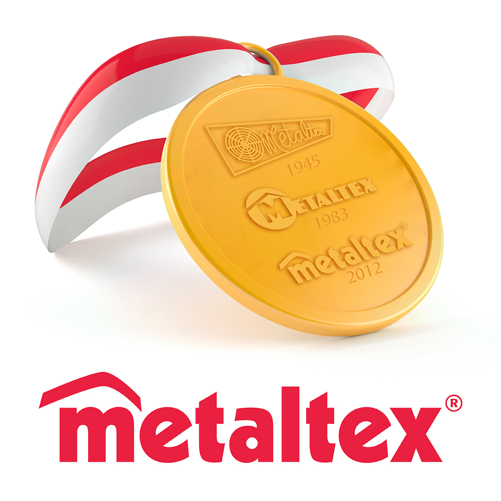
The first brand logo (created in 1945, the year Metaltex was founded) was represented by a grid of winding wire making up the name of the company. This first logo strongly emphasized the company’s specialization: production of articles made of iron wire.
Thirty-eight years later (1983) the brand underwent a major restyling: the company operates internationally with branches around the world and with an ever-increasing assortment. Metaltex felt the need of a stronger brand image, capable of transmitting an important presence on the global markets. Geometrical shapes and a distinguishable M: the logo that Metaltex used for three decades.
Today, thirty years after the first restyling, Metaltex moves on to a more dynamic and updated company logo.
The new brand appears “lighter” with round shapes, but always in the unmistakable red color. Color that represents Metaltex optimism, passion and vitality.
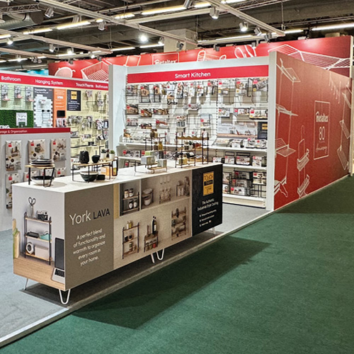
Come and discover the “new” Metaltex at Ambiente 2013 (Hall 6.0 – Stand C 02).